Twitch Clips Discovery Hub
Making relevant content more discoverable through a central hub for Clips on Twitch
Overview
India's live streaming market is rapidly growing, with platforms like YouTube Live and Instagram Live gaining popularity. However, the space is becoming crowded, making it challenging to discover new creators, find engaging content, and navigate the landscape effectively. Despite global success, Twitch has struggled in India due to late market entry, limited localization, and competition from platforms better suited to Indian preferences. As a personal passion project, I've set out to design a central home for short-form content, consolidating twitch's existing Clips feature into one place where users can consume and share them. My goal was to improve discoverability so that viewers could find more communities to call home, benefiting both streamers and viewers.
Getting discovered on Twitch is hard
Upon starting this project, I interviewed 5 small streamers to understand what their challenges with the platform are. Above all, Rohith meticulously crafts interfaces driven by humanizing interaction and software. To investigate why, I spoke to 5 existing Twitch viewers to test the current content-discovery and viewing experience (1a). I also conducted an individual app audit to fill knowledge gaps and pinpoint any key issues (1b).
Interview takeaways
Viewers struggle to find new content relevant to them in a timely fashion
Upon starting this project, I interviewed 5 small streamers to understand what their challenges with the platform are. Above all, discoverability on the platform was the top cited challenge.
pain points
Browsing is overwhelming
- Visually over-stimulating
- Endless amount of streams available with no clue where to start
- Difficult to search and browse through current filtering options
- People wanted additional context surrounding a streamer before investing time into them
Too much content, too little time
- Viewers are not always able to catch a stream when it's live nor can stay for the entire duration
- Viewer must constantly click in and out of streams in hopes of finding something even remotely entertaining (often after having sit through a 30-second pre-roll ad -> barrier of entry)
- People wanted better ways to consume content on-the-go
- People wanted additional context surrounding a streamer before investing time into them
Viewers will leave streams if they aren't engaged quickly
With 7 million monthly broadcasters on Twitch on average, Twitch is an active platform that has something for anyone, at any time. However, when a platform is abundant in content but lacking streamlined ways to curate them, viewers can experience decision fatigue. As a consequence, people leave — whether that's a few streams, or Twitch overall. For Twitch, this negatively impacts revenue, user retention, and daily average users (DAUs).
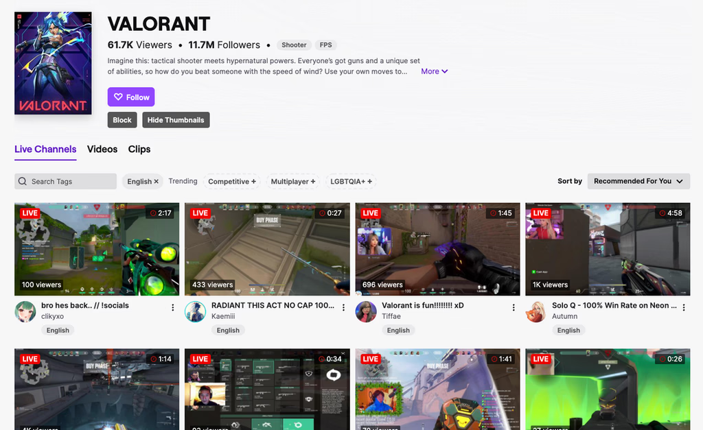
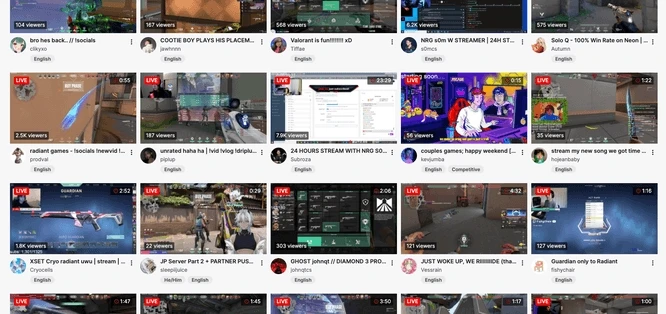
Viewers must scroll through streams to "find" something to watch, with limited info to base said decision off of.
Overall, viewers lack time and thrive on community. From my interviews, two main user types emerged: 'loyalists' who know who they like and just want consume the content they want, fast. This means focusing on experiences enabling quick and easy actions. On the other hand, there are 'explorers' who may not have creators they enjoy deeply yet but desire curation and connection. Their primary aim is to discover more communities to call home.
The 'Clips' experience is fragmented
Clips are 1-60 second long snippets of an existing live stream. Clips are 'clipped' by the community, so a streamer doesn't personally upload them (unless publishing on other platforms).
From my audit, I found that to access clips from the web app there are 3 entry points:
A) Scroll to the end of the home page,
B) Filter a streamer's videos by clips on their channel, or
C) Click any category in Browse and select the Clips tab.
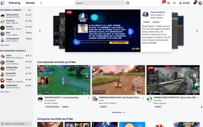
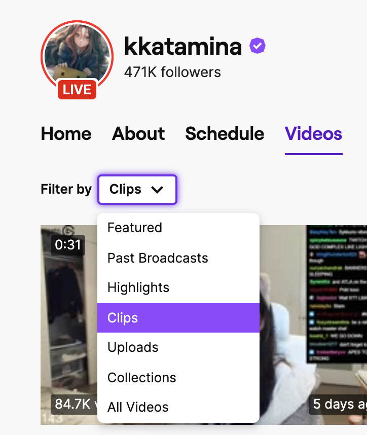

Short-form content is one of the best and fastest ways for a creator to get discovered, and for a viewer to discover streamers without having to sit through an entire stream. Burying Clips underneath different sections makes it less discoverable, and makes it harder to retain viewers since they can't tell what content is worth their time.
New to Twitch?
A quick crash course on Twitch lingo:
Subscription
- Viewers pay X/month based on tier (Tier 1, 2, or 3) and receive Y benefits as a result (i.e. no ads).
- Main way Twitch makes money
Bits
- A digital way to cheer for streamers like you would for a sports team
- One way Twitch makes money
Twitch Affiliate
- Streamers who can start monetizing their content through subscriptions, bits, etc.
- Before this stage, people can still stream but can't make income off of it from Twitch.
Twitch Partners
- A tier up from Affiliates
- Same benefits as Affiliate but with a higher percentage of payouts, increased emotes and badges for your community, and more.
Make relevant content more discoverable
My main design goal is to make it easier and faster for viewers to consume relevant content (relevant as in entertaining, educational, and/or suits the viewer's interests). This not only directly increases revenues for Twitch, but indirectly does so since streamers are motivated to continue streaming.
Business Impact
- Increased user retention & attraction: If users are able to discover content they enjoy, they're more likely to stay. If it's too hard, they'll give up.
- Increased revenues: More engaged users increases the chances of them subscribing, sending bits, or supporting streamers in other ways.
User Impact
- Less decision fatigue
- Less time wasted on searching, more time spent engaging
- More streamers can make money doing what they love
- More fun, more community
How might we help users discover content they like faster?
When approaching ideation, I prioritized exploring volume and the breadth of what was possible; out-of-box solutions for enabling viewers to discover relevant, tailored content quickly whenever they land on Twitch's website. Out of a few conceptual directions explored, I decided having a central hub for clips would have the most direct impact in solving viewer pain points.
Introducing new ways to preview content
Idea No. 1
A central hub for clips to bolster recommendations
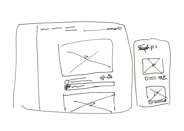

Rather than fragmented entry points, viewers can watch and engage with clips all in one central location.
Idea No. 2
Timestamped clips on VODs to signal high-interest durations
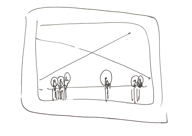
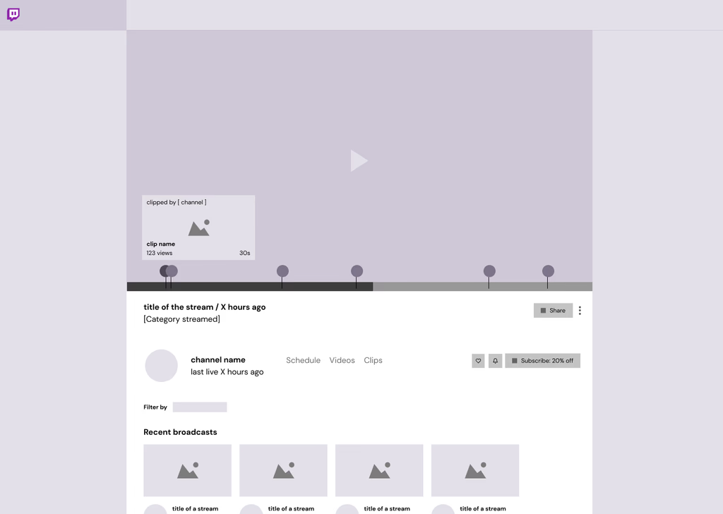
When reviewing past broadcasts, viewers can quickly access highlights based on visual clustering of clips.
Idea No. 3
Profile preview cards to provide additional context
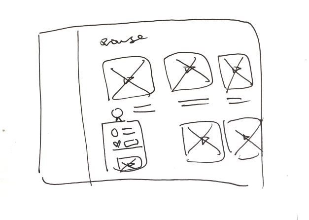
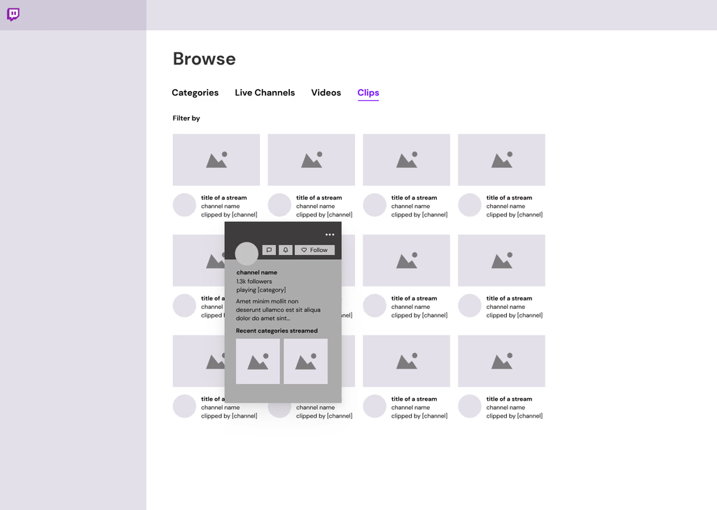
On hover, viewer can quickly assess if they find a streamer interesting without having to click in and out of streams.
How might we help users discover content they like faster?
When approaching ideation, I prioritized exploring volume and the breadth of what was possible; out-of-box solutions for enabling viewers to discover relevant, tailored content quickly whenever they land on Twitch's website. Out of a few conceptual directions explored, I decided having a central hub for clips would have the most direct impact in solving viewer pain points.
Idea No. 1
A central hub for clips to bolster recommendations


Rather than fragmented entry points, viewers can watch and engage with clips all in one central location.
Idea No. 2
Timestamped clips on VODs to signal high-interest durations


When reviewing past broadcasts, viewers can quickly access highlights based on visual clustering of clips.
Idea No. 3
Profile preview cards to provide additional context


On hover, viewer can quickly assess if they find a streamer interesting without having to click in and out of streams.
A central hub for clips
Moving forward, I decided to focus on centralizing short-form content on Twitch, with Clips at the forefront.
Approach No. 1
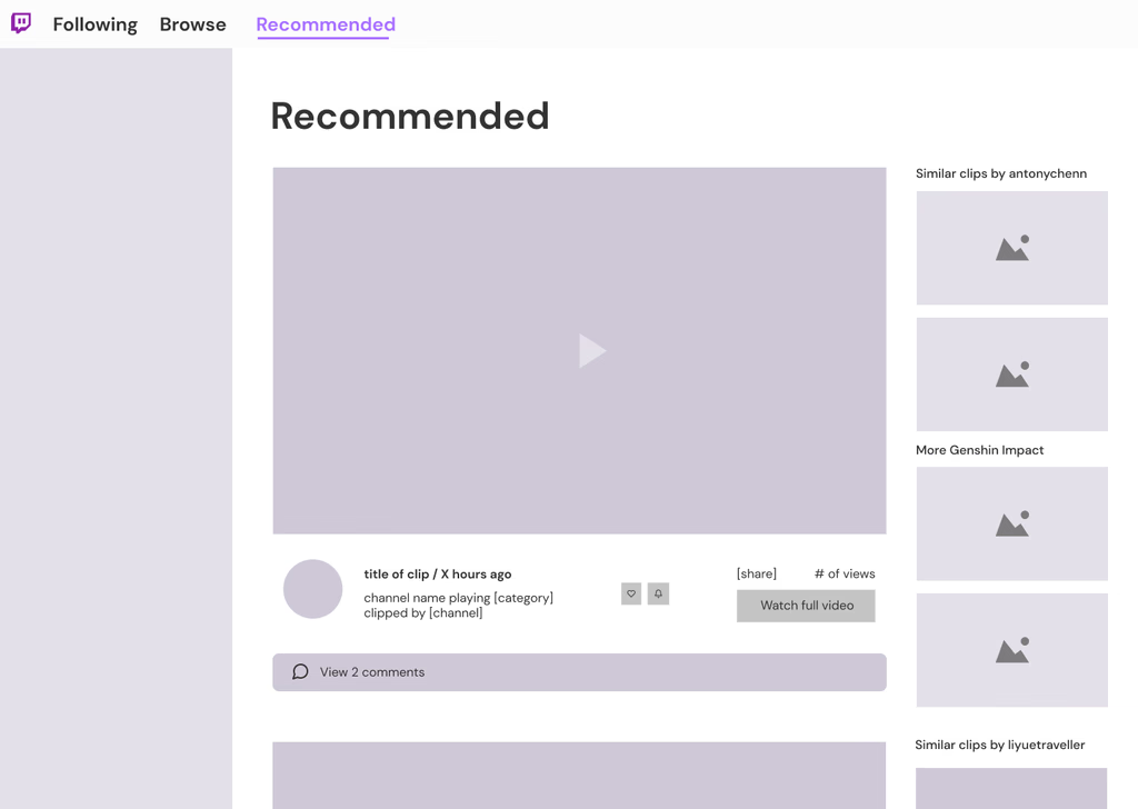
A central hub for clips to bolster recommendations
Clips are displayed in a feed-like fashion, recommeding clips based on factors such as previous watch history recently clipped interaction and similar creators.
Approach No. 2
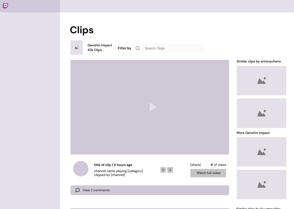
Focused content discovery
Viewer can control what kind of clips they want to see by category and tag. While there is still curation within a category, it offers a narrow search.
Approach No. 3
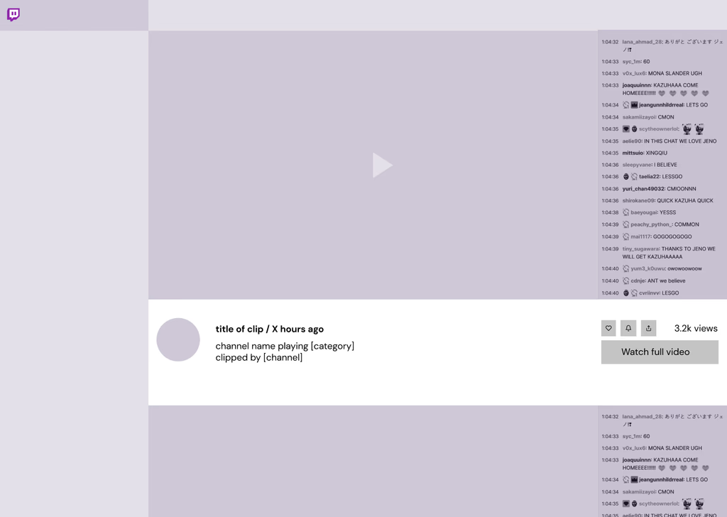
Immersive, theatre-view experience
Similar to Twitch's current livestream viewing experience. Lacks interaction; can watch clips in an infinite scroll fashion.
Approach No. 4
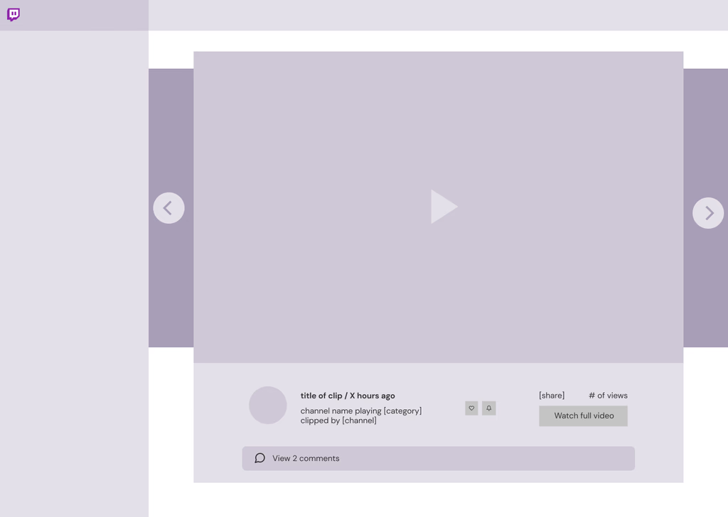
Autoplaying Carousel
Similar to Twitch's current clip-watching experience, only this would be in a separate page and autoplay clips as it continuously cycles through content.
A central hub for clips
Moving forward, I decided to focus on centralizing short-form content on Twitch, with Clips at the forefront.
Approach No. 1
A central hub for clips to bolster recommendations
Clips are displayed in a feed-like fashion, recommeding clips based on factors such as previous watch history recently clipped interaction and similar creators.

Approach No. 2
Focused content discovery
Viewer can control what kind of clips they want to see by category and tag. While there is still curation within a category, it offers a narrow search.

Approach No. 3
Immersive, theatre-view experience
Similar to Twitch's current livestream viewing experience. Lacks interaction; can watch clips in an infinite scroll fashion.

Approach No. 4
Autoplaying Carousel
Similar to Twitch's current clip-watching experience, only this would be in a separate page and autoplay clips as it continuously cycles through content.

Gaining feedback from the community
After experimenting with different iterations for the Clips hub, I wanted to uncover any usability issues and/or mismatches in expectations, as well as marginal benefits of the feature. Was this something Twitch users would embrace or love to use? If not, what could be improved? This is what I found after talking to and testing designs with 5 viewers comprised of both new and long-term users:
Findings
Navigation labels did not match mental models
While testing the flow, 3/5 users reported confusion surrounding the tabs 'Recommended', 'Following, and 'Discover.' They weren't sure what the difference was between them. To address this, I changed the copy from 'Discover' to 'Browse', which was more distinct from the other two tabs and more consistent with Twitch's existing information architecture.
User actions had low visibility
While testing interactions with clips, users failed to notice the actions underneath a clip i.e. like, comment, share as it blended in with the information. I then moved the actions to the right of the clip for easier and faster access to clip engagement. Along with this decision, I removed the filter sidebar as it was redundant when you could already filter in Browse.
Difficult to retrieve 'liked' and 'saved' clips
While users generally liked the concept of being able to bookmark certain clips by 'liking' and 'saving' them, they felt it was too difficult to actually retrieve clips they saved due to the infinite scroll format. There was also confusion over the difference between 'liked' and 'saved'. I decided to transform the views within these two pages in a familiar grid layout instead to easily view at-a-glance all liked and saved clips.
A central Clips hub to help viewers find more communities to call home
In this central hub, I created various sections to organize Clips:
- A tailored recommended view which aggregates data compiled from a combination of factors such as watchtime, similar streamers, and interactions (like, comment, share)
- Interaction features introduced so that viewing Clips is a less static experience, and involves the community
- Discover page is an opportunity to search and browse for clips in one location
- Ability to then collect and view previously watched clips lies in the Liked and Saved tabs
- Consumption of clips is done in an infinite scroll fashion
Measuring results through Clips data
While I don't work at Twitch and may not know the full picture of the product, Clips as a feature, engineering capacity, or know the users as intimately as the research team might—I have confidence in the adoption of this idea should it follow an appropriate validation and iteration cycle. I believe success could be measured through these metrics:
- # of viewers who came to a livestream or channel from a clip
- # of new followers and/or subscriptions to a channel directly from a clip
- # of hours spent watching clips & livestreams, compared to previous levels
It's okay to pivot.
As an active user in the space, there were so many areas I wanted to explore and address but ultimately had to scope it down to one problem for feasibility. This study was actually the result of multiple rounds of problem definition and scoping - I had a lot of trouble figuring out what was the right problem to work on, and understanding if the issues were actually issues. But I enjoyed all of it as part of the process and it felt really good to finally gain some clarity after the initial struggle :)
Mitigating potential user and business issues
Given the scope of this project, I wasn't able to address every single issue that surfaced. Here are some of the considerations I had and potential avenues for solutions I would want to explore with more time:
- Introduction of moderation and other safeguards to protect against harassment (i.e. an option to report comments and/or users, option to disable comments on a clip
- Exploring a 0 views and 0 viewers feed to see how views may impact user behaviours
- Ways to access clips from creators who are currently offline (since my idea only allows for clips to be displayed from streamers who are currently live)
- Enhancing search, filtering, and sorting capabilities of clips (i.e. adding tags to clips)
- Expanding on user interactions (i.e. Reacts with popular Twitch emotes, ability to share clips in-house to Friends)
- Adapting views for the mobile app, and implementing dark mode