Google, Meet Quirky UX
When even Google's design falls short of expectations
I love google. Am a big fan of almost all their products and an even bigger fan of how they themselves kill their own products for no reason at all. Google domains, Chromecast, stadia and other 293 apps, services and hardware. Even after all this I still love google. Their products often create the benchmark others aspire to. Their designs almost always are intuitive and clean. But somehow the last time I used Google meet I couldn't help but notice a few quirks in the design — those little bumps that seemed minor at first but started piling up, making the whole experience feel less than seamless.
As a UX designer, and someone who has an 'opinion piece' in their portfolio I couldn't help but dive more in so that I could write about it. From mismatched terminology to unpredictable component behavior, I found several areas where Google Meet interface could be improved.
Am focusing on desktop for now cause frankly mobile is much much worse and am too lazy to write an even bigger piece.
Positive Aspects: What Google Meet Gets Right
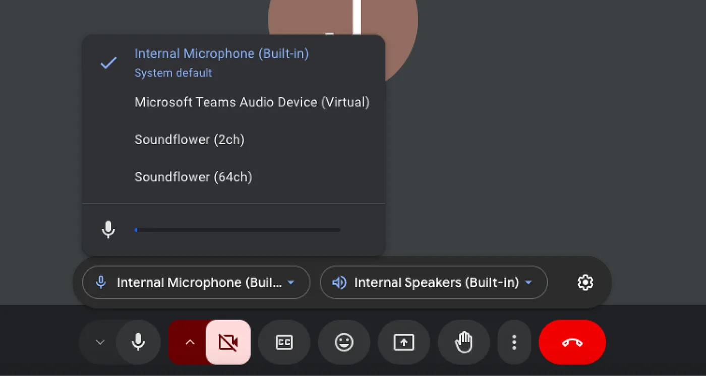
Ability to switch microphone and camera
Switching mic and camera is now pretty easy! Google made it hassle-free by putting the controls right where you need them. No more digging through settings — just a quick switch between your earbuds, speakers, or webcams.
Sleeker and smarter: Updates to the screen-sharing interface
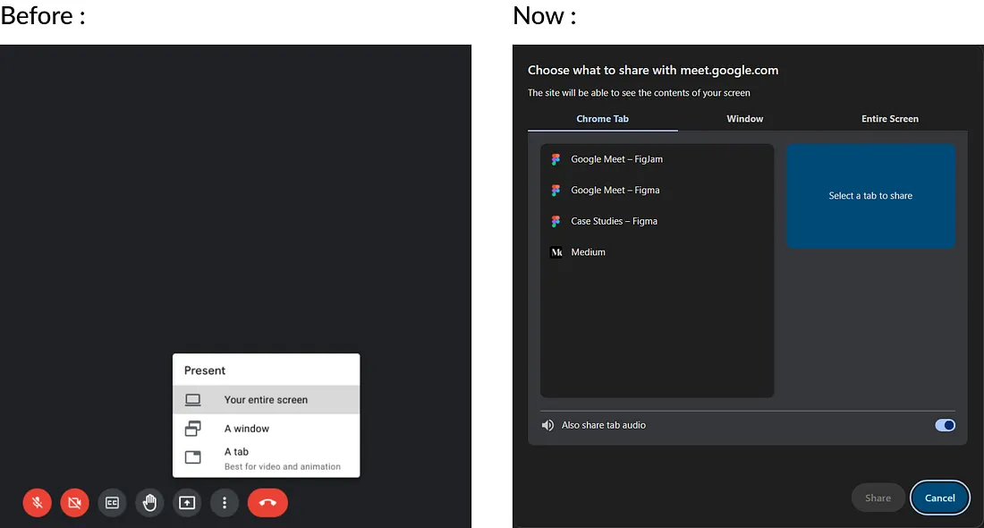
Google ditched the old step-by-step screen-sharing flow for a new tabbed interface. Now you can switch between sharing options in one place. No more canceling and restarting after picking the wrong option — just switch tabs. Makes life much easier
Quirky UX and google?
With over 3 billion users, it's surprising how Google still has so many inconsistencies and a clunky user experience. I try to highlight key areas where better UX could make the experience smoother and more impactful.
Inconsistent Design
one big issue in Google Meet's interface is styling inconsistencies, which can be confusing and break the cohesive feel. It seems some of this comes from a messy transition from M2 to M3, while the rest might just be a lack of attention to detail in design or development. Either way, this is feels off from Google!
1) Button Shapes Gone Rogue: A UX Disruption
One of the biggest changes in the UI is the icon button shape. When inactive, it's round, but when active, it's a rectangle with rounded corners. Changing shapes adds unnecessary mental effort, disrupting familiar patterns and interrupting the user's flow.
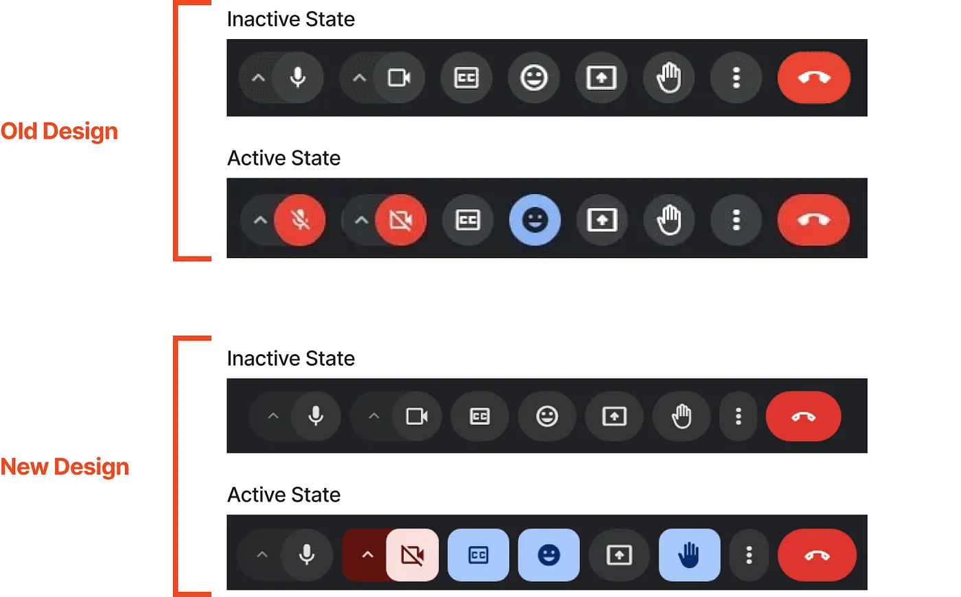
Another inconsistency is that, unlike the old UI, not all buttons are rounded in the new one. Some are stretched, either vertically or horizontally.
2) Inconsistency in Modal Components
Google Meet has a clear inconsistency between the Share Screen modal, which follows the Material 3 design, and the Settings modal, which sticks to an older style. This mismatch messes with the flow, this impacts the app's perceived quality, and hurts the app's overall feel and brand coherence.
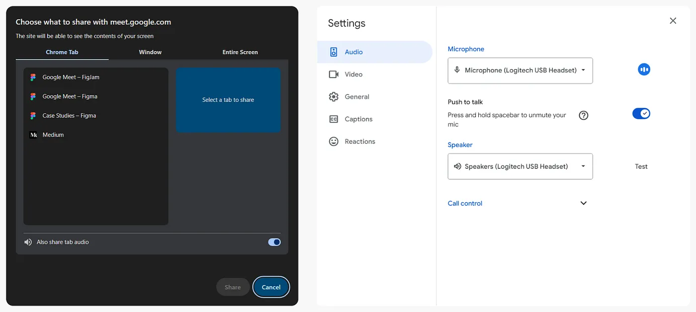
A look at some key issues with these modals as of today.
The Share Screen modal follows M3 Design Dark theme guidelines and lets you switch themes based on your choice. But the Settings modal is still stuck with just the Light Theme — no Dark Theme option.
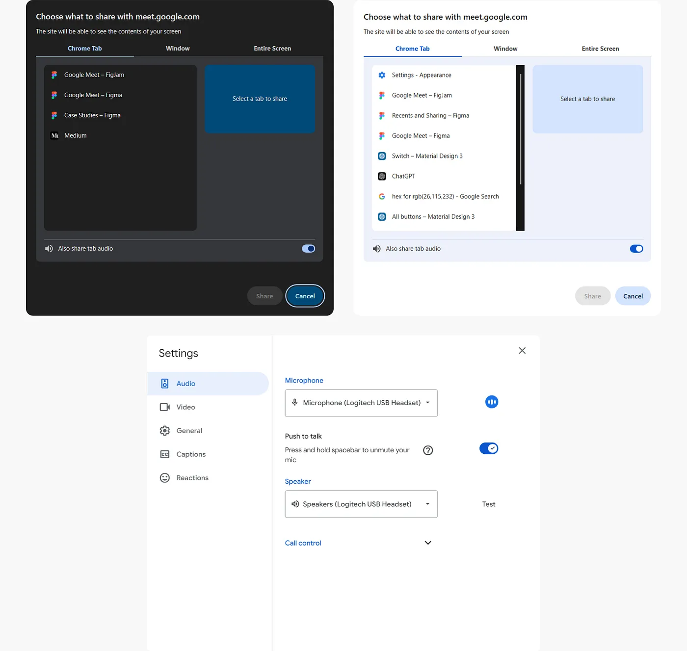
Even though the Share Screen modal follows M3 guidelines, the toggle button still looks like it's from M2, just with M3's color scheme.
There are different shades of blue scattered throughout the application, which don't even match the latest Material Library — Static Color Scheme. Talk about feeling blue!

Material Library Color Palette (Standard Color Theme)
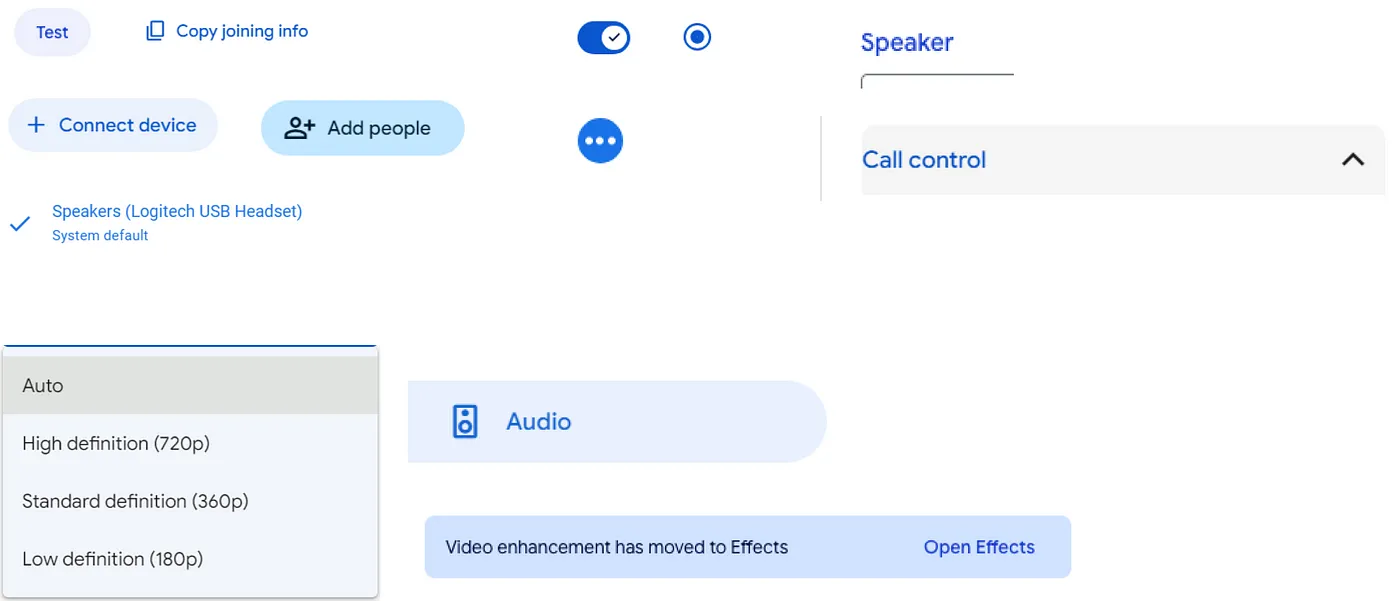
The image above displays the various shades of blue used throughout the application, none of which align with the Material Library's Static Color Scheme.
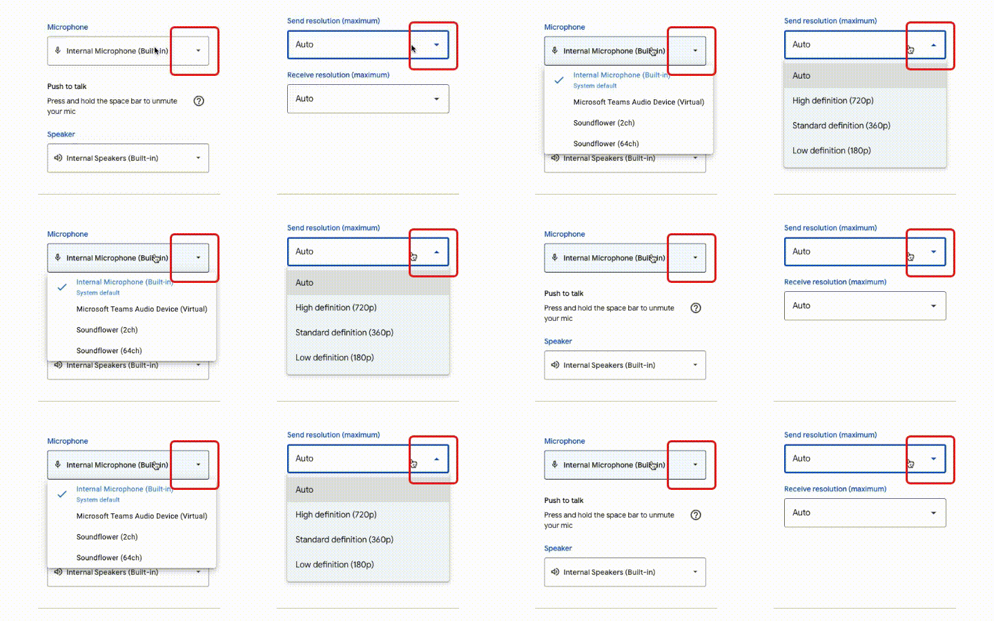
Google Meet has some serious dropdown issues. While some dropdowns use the old M2 style with problems like the arrow not changing direction and inconsistent menu widths. Others are updated to M3 and work smoothly.
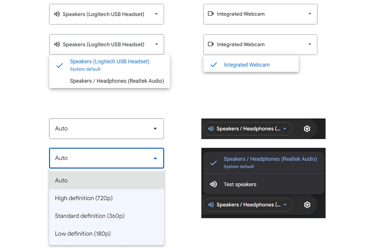
Here's another issue with the dropdown. Check out the image below — why are the arrows on the left side? Pretty much every app places them on the right, so this just feels off and disruptive.

The inconsistent label styling in Google Meet — switching between grey and blue, along with varying fonts and styles — can be really confusing.
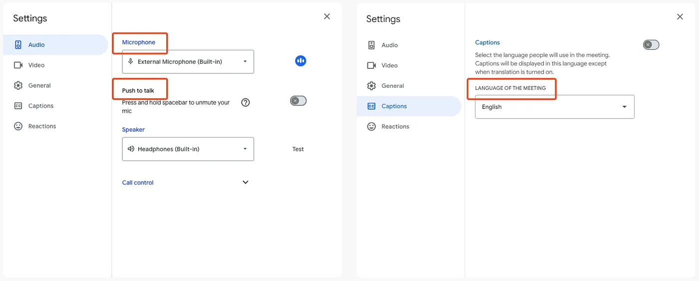
To make things worse, blue usually means something's clickable, but when it's not, it misleads users and causes unnecessary clicks or hesitation. Check out the clip below — blue labels aren't clickable, but the grey ones, which are for toggles, actually are!
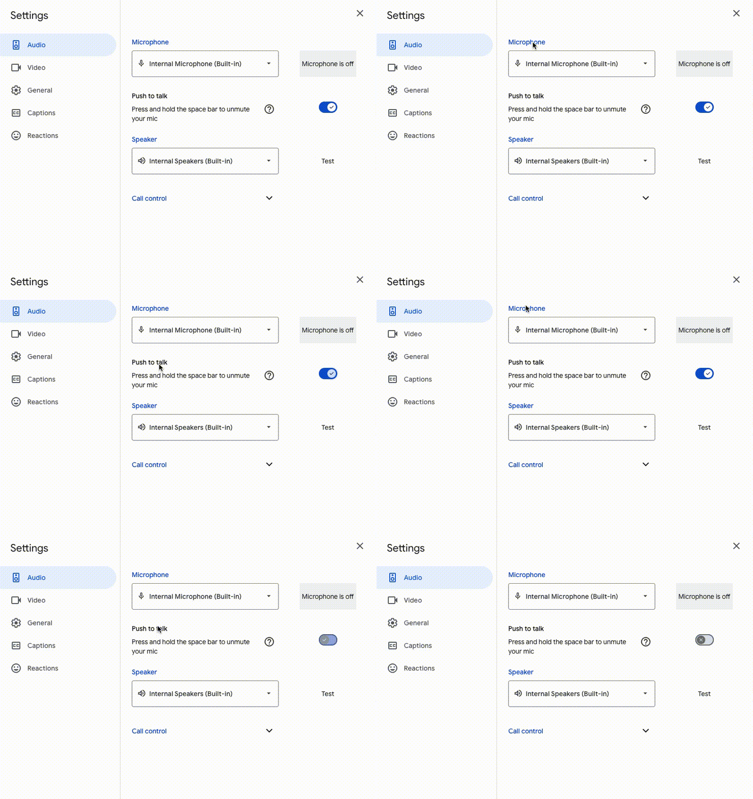
Here's another issue with labels — this time accordion! 'Call Control' accordion has no padding, making the content feel cramped. Also, was it really necessary to hide the call controls in an accordion? Keeping them upfront would make things more accessible and save users the extra clicks to access key functions.

Inconsistent button affordances can lead to user confusion, especially when buttons don't look interactive.
Take a look at the 'Test' button in the speaker section — it looks like plain text, making it seem non-clickable. I totally missed it at first!

When Google Ignores Its Own Brand Guidelines
In the 'Share Screen' modal, both the 'Share' and 'Cancel' buttons are filled buttons, making it hard to tell which is the primary action and which is secondary.
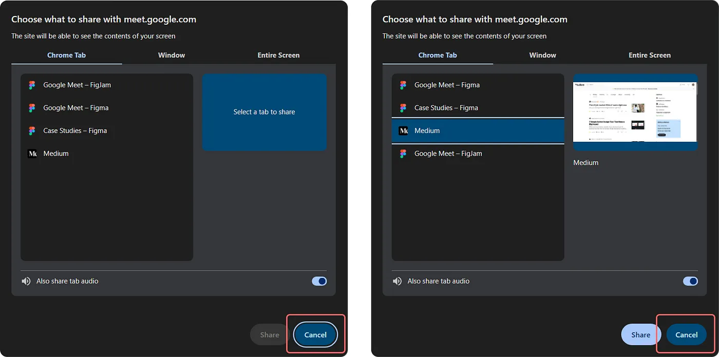
Refer to the 'Cancel' button present in the screenshot above.
Even though 'Cancel' button is using one of the variation provided in the M3 library for Secondary Button, it fails to meet guidelines provided for their usage.
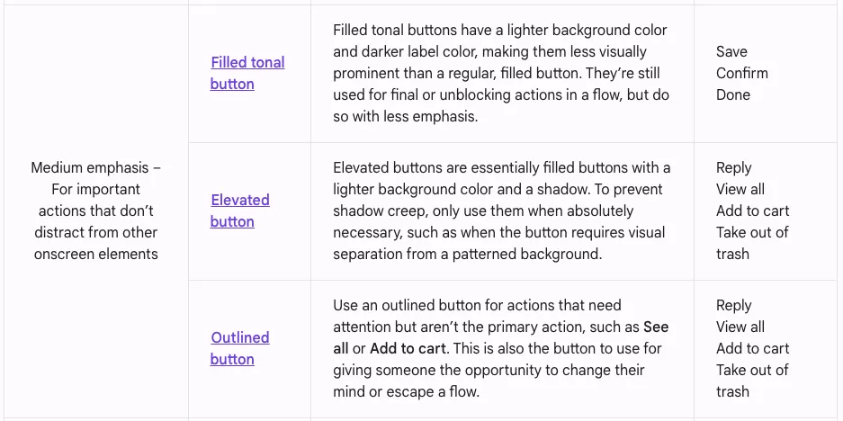
According to Material Design guidelines for buttons for medium emphasis actions, each serving a distinct purpose to guide user interactions effectively.
Right now, Google Meet uses a 'Filled Tonal Button' for the 'Cancel' action. This style is meant for primary / final actions with lesser emphasis, like Save or Done. Material Guidelines recommend using 'Outlined Button' for escape actions.
Unexpected behaviour
This section highlights some unexpected behaviors in Google Meet that can disrupt the user experience. While small, these inconsistencies — like issues with visual feedback and interactions — can cause confusion or hesitation for users.
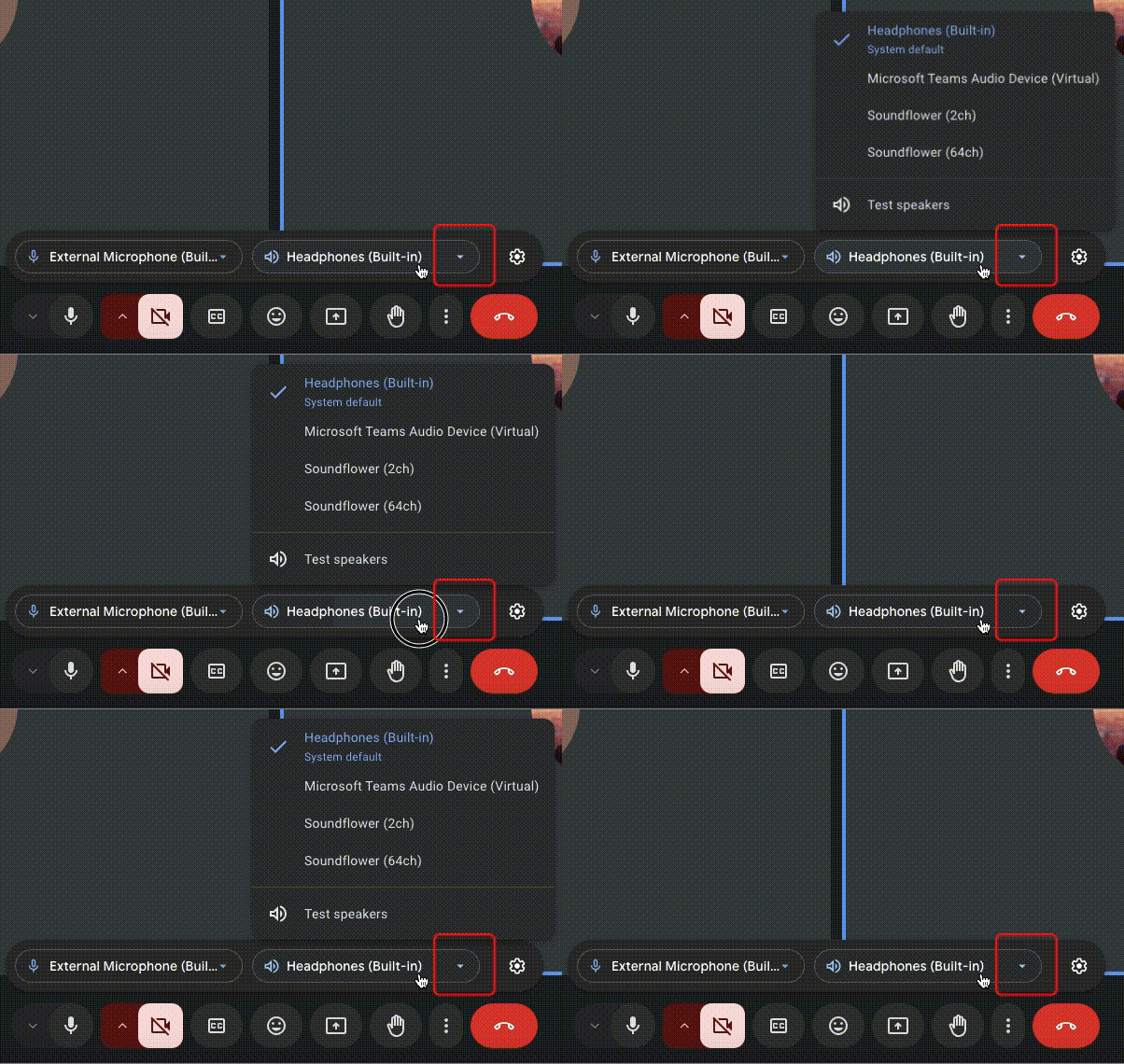
i) Dropdown Arrows That Don't Follow the Flow
In Google Meet, certain dropdown menus lack the standard behavior of flipping the arrow icon upon expansion.
ii) Seamless to Disruptive: Reaction bar experience
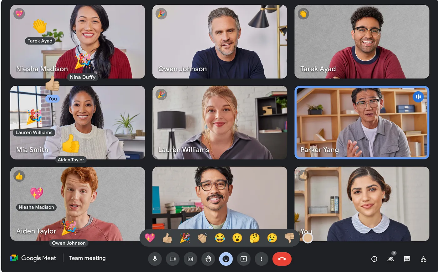
In Google Meet, selecting a reaction emoji causes the entire app content to resize, shrinking temporarily to fit the expanded reaction bar and then re-expanding when you deselect it. This shifting layout feels disruptive compared to the old experience, where the reaction bar floated over the content without affecting its position.
The previous experience was better, with the reaction bar seamlessly overlaying the content.
Opportunities for UX Improvement
There are several key enhancements that could significantly streamline interactions and improve functionality in Google Meet.
1. Improved button groups
Grouping related buttons more intuitively would reduce visual clutter and streamline navigation, allowing users to locate important actions faster, enhancing overall efficiency.

2. Ability to copy meeting link
Allowing the meeting link to be copied with a single click would make sharing meeting details quicker, cutting out extra steps in the current process.

3. Replace clock with meeting duration
Displaying the meeting duration instead of a clock could help users stay aware of time spent in the session without needing to track it manually, making it easier to manage time effectively within the call.

4. Verbiage consistency
This is tiny thing, but do I present screen or share screen?

5. File sharing in chat:
This is one of the most requested features out there, and let's be honest — it's a must-have for meetings. Adding the option to send attachments or screenshots directly in the chat would make it easier for users to share important resources in real-time, without having to jump between platforms.
Design hiccups, unexpected quirks, and clunky interfaces can make things frustrating. Fixing these — like tightening visuals, simplifying actions, and making controls easier to find — could make the experience so much smoother and more intuitive.